|
||
|
Statistical Process Control (SPC)
Statistical Process Control (SPC)
is a system for monitoring, controlling, and improving a process through
statistical
analysis. It has many aspects, from control charting to process
capability studies and improvement. Nonetheless, the
over-all SPC system of a company may be broken down into four basic steps: 1)
measuring
the process; 2)
eliminating variances
within the process to make it consistent; 3)
monitoring
the process; and 4)
improving
the process. This four-step cycle may be employed over and over again
for continuous improvement.
Bulk
of SPC concepts in use today were developed based on the premise that
the process parameter being controlled follows a
normal distribution.
Any SPC practitioner must be aware that the parameter must first be
confirmed to be normal before being subjected to analysis concepts based
on normal behavior. Thus, any discussion on SPC must be preceded by a
discussion of what a normal distribution is.
LINKS:
The
normal
distribution
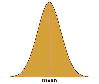
(see Fig. 1),
normal curve, or bell-shaped curve, is probably the most recognized and
most widely-used statistical distribution. The reason for this is
that many physical, biological, and social parameters obey the normal
distribution. Such parameters are then said to behave 'normally' or,
more simply, are said to be 'normal.' The
semiconductor
industry has many processes that output data or results that comprise a
normal distribution. As such, it is important for every process
engineer to have a firm grasp of what a normal distribution is.
Aside
from the fact that the normal distribution is frequently encountered in our
day-to-day lives, the mathematics governing normal behavior are fairly
simple. In fact, only two parameters are needed to describe a
normal distribution, namely, the
mean or its center, and the
standard
deviation
(also known as
sigma) or its variability. Knowing both parameters is equivalent to
knowing how the distribution looks like.
The normal
distribution is bell-shaped, i.e., it peaks at the center and tapers off
outwardly while remaining
symmetrical
with respect
to the center. To illustrate this in more tangible terms, imagine
taking down the height of every student in a randomly selected Grade 5
class and plotting the measurements on a chart whose x-axis corresponds
to the height of the student and whose y-axis corresponds to the number
of students.
What is
expected to emerge from this exercise is a
normal curve,
wherein a big slice of the student population will have a height that is
somewhere in the middle of the distribution, say 57-59 inches tall.
The number of students belonging to other height groups will be less
than the number of students in the 57"-59" category .
In fact, the number of students
decreases at a calculable rate as the height group moves further away
from the center.
Eventually you might find only one shortest student at, say, 48", and
one tallest student who probably stands at 66". Lastly, plotting the
number of the students falling under different height ranges of equal
intervals will result in a bell-shaped curve. Such a plot is called a
histogram,
a simple example of which is shown in Figure 2.
Figure 2.
Example of a histogram of heights of students in a Grade 5
class; the
y-axis corresponds to the number of students per category
Copyright
©
2003-2005
SemiconFarEast.com.
All Rights Reserved. |
||